Planning note · design strategy
How to build a t‑shirt bar design menu guests actually love
The menu board decides more about your event than the press does. After watching thousands of guests stand in front of that board, here is the formula we push every client toward.
Six slots. Not twelve. Definitely not twenty.
Choice feels generous until it stalls a line. Guests facing six options decide in seconds; guests facing fifteen ask the person behind them what they are getting. Our throughput data is blunt about this: menus past twelve options slow the board more than any press ever slows the platen. Six is the sweet spot; eight is the ceiling for crowds with time to browse.
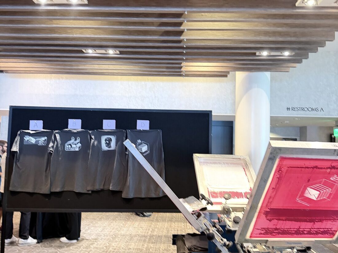
The slot formula
- Two anchor designs — the official marks: event logo, brand lockup, school spirit
- Two audience designs — made for subgroups: a program, a team, a city, an era
- One wildcard — the joke, the meme, the design legal almost vetoed
- One flex slot — seasonal, co-brand, or a second wildcard if the first tests well
The wildcard needs defending in every planning call, so here is the defense: it outsells the primary logo at roughly two to one, almost every event. People wear jokes. They tolerate logos.
Design for the garment, not the deck
Art that looks great on a slide dies on a shirt: hairline strokes vanish, tiny type fills in, and edge-to-edge layouts fight seams. Big shapes, confident color, one idea per shirt. Full-color DTF handles gradients and photo detail beautifully — the constraint is legibility at six feet, because that is where the next guest in line is standing.
Proof on the actual blank
Colors shift on fabric, and heather blanks mute everything a step. We press physical proofs of the full menu on the exact blanks for the event and photograph them for sign-off — two weeks out, so there is a revision window. The menu board itself then displays those proofs, which is why guests trust what they order: they are looking at the finished product, not a rendering.
Let the menu learn
Every event ends with a count of what pressed, by design. Recurring programs should treat that as menu research: keep the winners, evolve the middle, replace the loser. The market case study shows what three weeks of that iteration did to repeat traffic. Ready to draft yours? Start the quote and bring your roughest ideas — art direction is included.